TechDesk
One-stop IT Management SaaS Platform
Design System
IA
UX / UI
Background
Millions of SMBs across Europe are struggling to develop an individual solution to their IT problem. This platform is helping SMBs in Europe to manage their entire IT on a one-stop platform. The platform creates real-time transparency into the IT operations and enables immediate action.
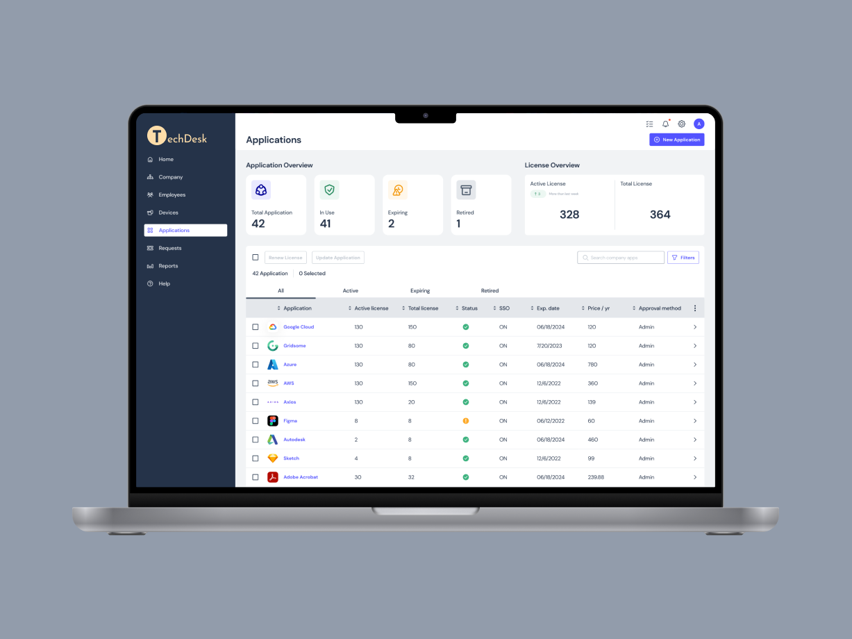
The platform serves both user (company employee) and admin (company IT manager). For this project, we were asked to focus on creating the Admin Panel for the system.
*To comply with my confidentiality agreement, the company name and logo has been removed.
Project Type
Desktop design
SaaS platform
Project Timeline
August 2022 - September 2022
My Main Contribution
Information architecture
Design system
Application page design
Tools
Figma
Miro
Where do we start?
PROJECT KICKOFF
At first we didn’t have a clear idea or specific goals for the project scope. We listed out our questions, and prepared a research kickoff workshop as our first meeting with the clients to understand what has already been designed, and to clarify the goals for this project.
OUR GOAL
Set the Design Guideline
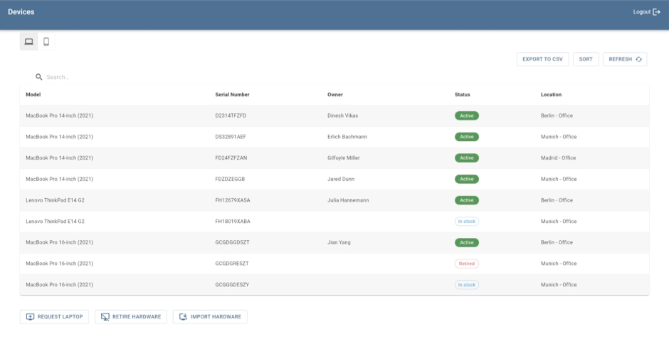
For this phase of the project, the client is looking for a device inventory page and an application inventory page redesign to capture their required information and actions.
Meanwhile, they wanted us to develop a design system as a guideline for future develpment, to improve the overall user experience and to provide visual consistency for the product.
OUR CHALLENGE
Design Prioritization within Time Constraint
Although our client started to build the testing version of the product already, the only design element they had was their logo. Our task, however, was to start from scratch developing the design system.
Prioritizing the main focus of the first phase of the MVP design within the time constraint was our biggest challenge.
The client was asking for a design solution of their service platform, however, the project turned into a much deeper dive into the higher level of the overall project structure and re-organizing the information.
OUR PROCESS
A Design Sprint Approach
How might we
design an intuitive, actionable and user-friendly platform that anyone without an IT background can manage?
THE DISCOVERY
29 User Interviews
The interviews were conducted by the client and shared the interview notes with us. We then created the affinity map together to synthesize and categorize the information to understand users’ needs and motivations for using the product.
90%
Said an all-in-one platform for IT management is needed.
62%
Complained current platform using is too complicated.
72%
Were interested in direct device purchase through the platform.
Competitive Analysis
Based on the research, we looked at current products our target users are using to understand the competition and the users’ needs. We listed out the features that are important according to user interviews and evaluate our competitors to see how we can stand out by providing the features and services our target users need.
The current competitors in the market were not targeting startups that required an all-in-one platform, thus there was an opportunity for us to create a platform that contained both IT&HR management features that our target users wanted. Another insight was that half of the exiting products doesn’t have an intuitive UI design for non-tech users.
“The competitors are not targeting startups that need an all-in-one platform.”
Information Architecture
Based on the base structure provided and the user interview results, I took the lead on restructuring the IA to sort out the layers of information. After deciding our design focus for this stage, I worked on clarifying the actions needed for each part and how much detail was needed to be displayed for both device and application management pages.
Teamwork and Process
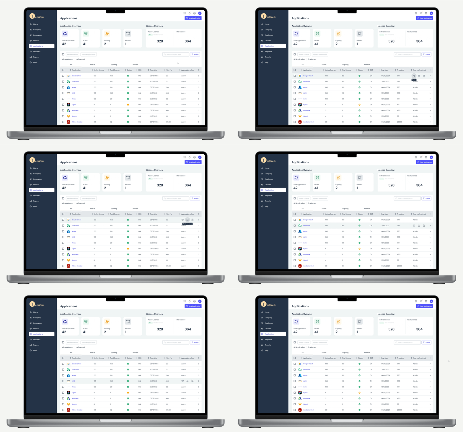
For application page design, I initially proposed 2 design directions: list view & icon view. After the discussion with the clients, we agreed on further developing the list view which can contain more information without clicking into the detail page.
4 Major Design Considerations
01
How can we restructure the menu bar to minimize confusion?
02
How to better visualize data for users to understand at first glance?
03
How to design a readable table to contain 2X information needed?
04
How can CTA buttons be more appealing to minimize learning for users?
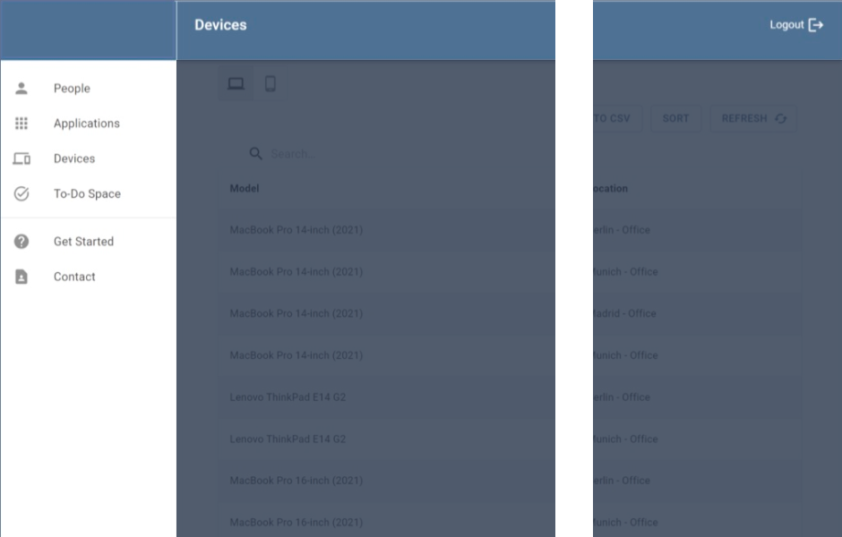
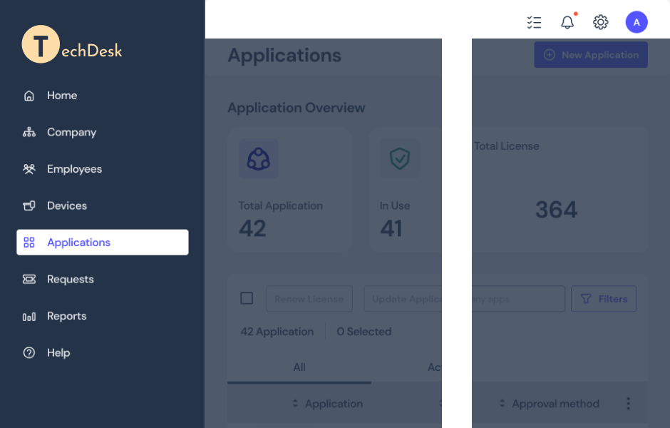
Menu Bar Layout Re-organize
SOLUTION 01
Problem
No place for overviewing all information.
No tickets overview.
Need to include reports and analysis.
No personal profile or settings.
Solution
Re-organize information architecture to include required pages.
Primary navigation on the left side for easier scan, users can quickly scan through the main features of the product.
Secondary navigation on top contains information on a more personal level for the user.
SOLUTION 02
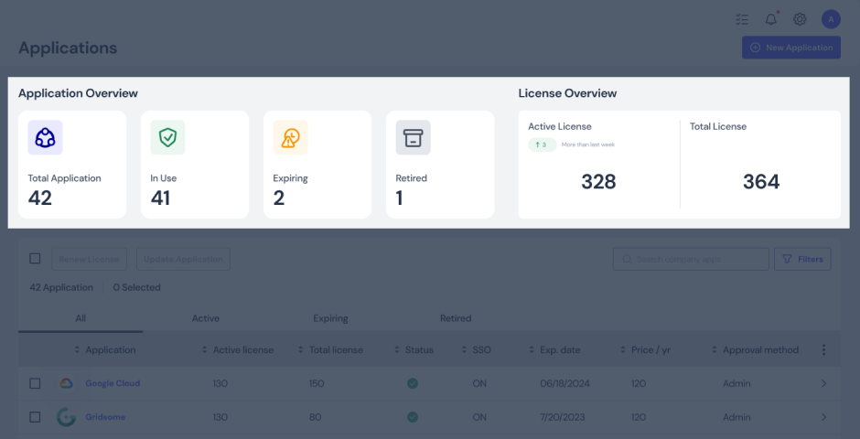
Add a High Level Overview
Problem
Hard to get an idea of the total number of applications and licenses.
Hard to spot the issues needed attention.
Solution
Having a table summary on top provides an overview of the table information. It allows the user to easily spot the issue and quickly resolve the problem.
SOLUTION 03
Table Redesign
Problem
Visual hierarchy not clear, header row is not obvious.
Need to fit in more information.
Require sorting and customizable table.
Missing pagination.
Solution
A brand new table design that is user friendly, customizable, and contains all required information.
CTA Buttons Redesign
SOLUTION 04
Problem
CTA buttons not intuitive, first time user can’t find the buttons on the bottom especially when the list grows longer.
No hierarchy between buttons.
Solution
Categorize action buttons to create hierarchy and bring clarity.
“Add New” button as stand alone button. Use primary button settings so it’s easy to find.
Bulk action buttons on top of the table to improve visibility.
Hover actions on single row item to reduce visual clutter.
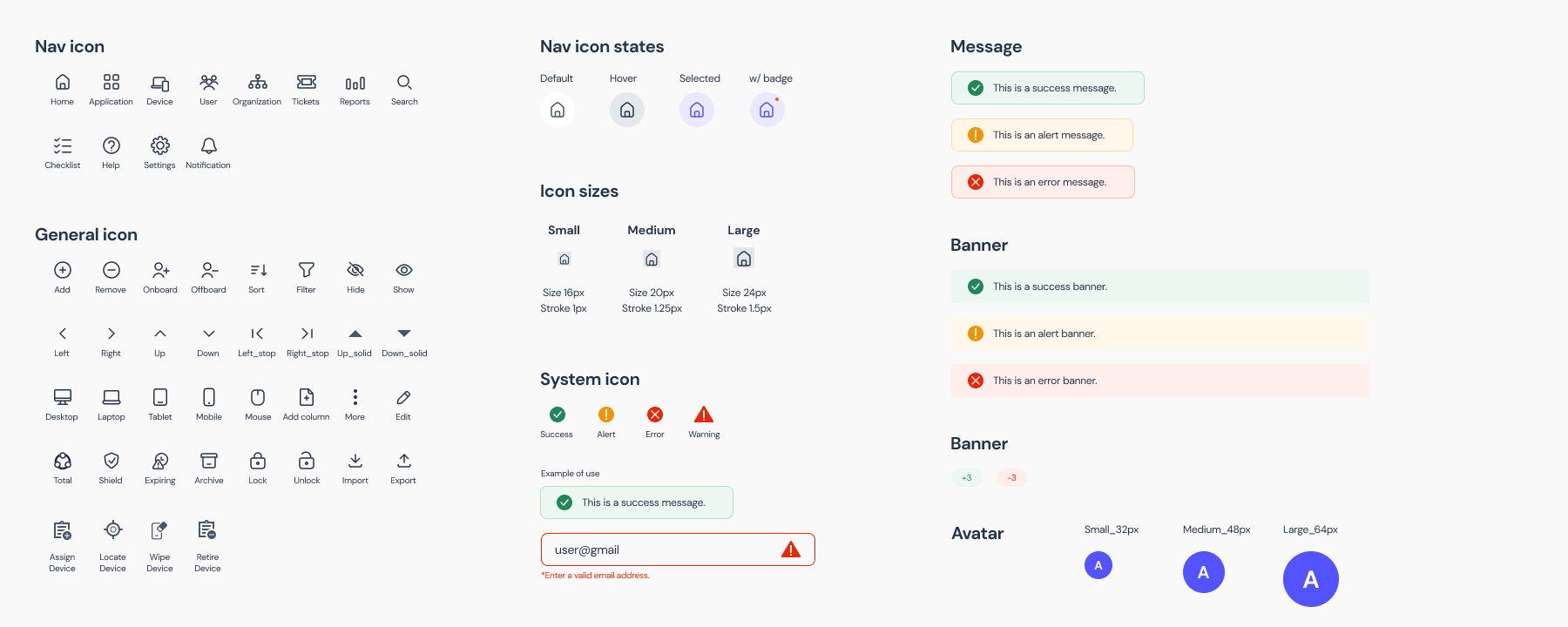
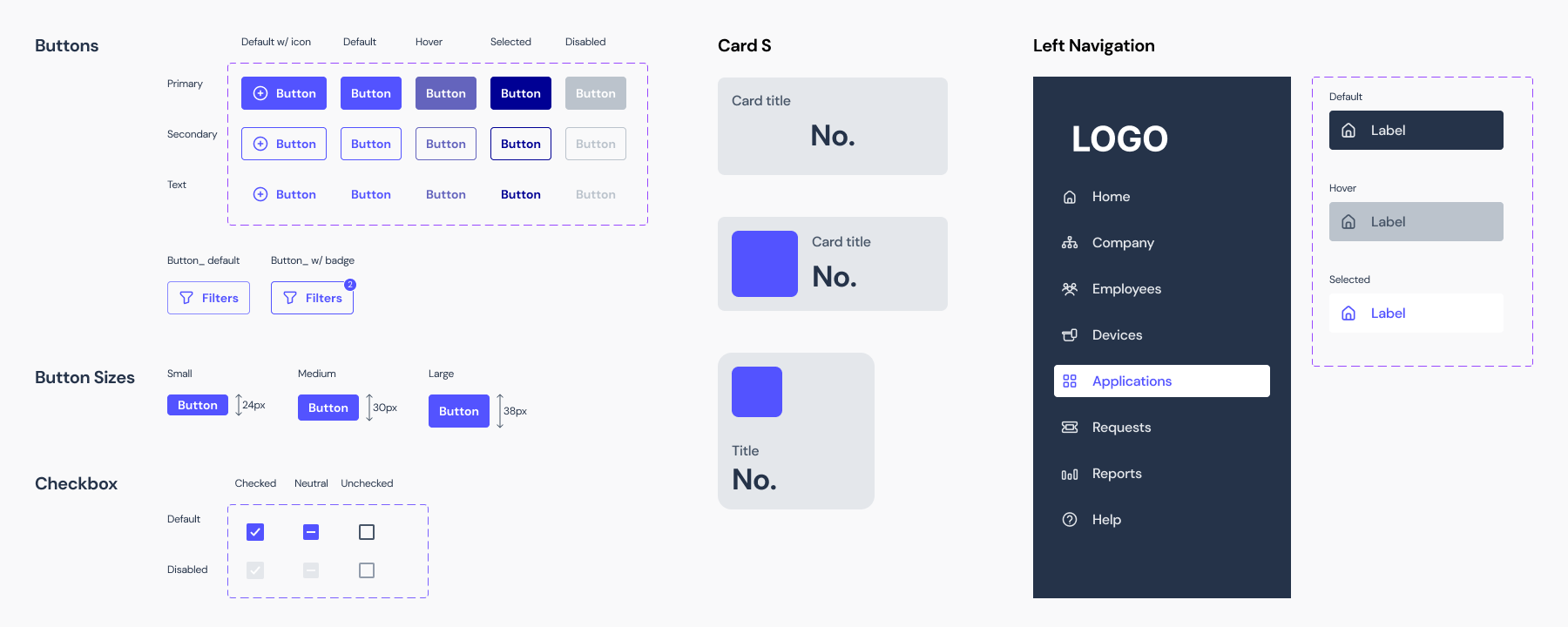
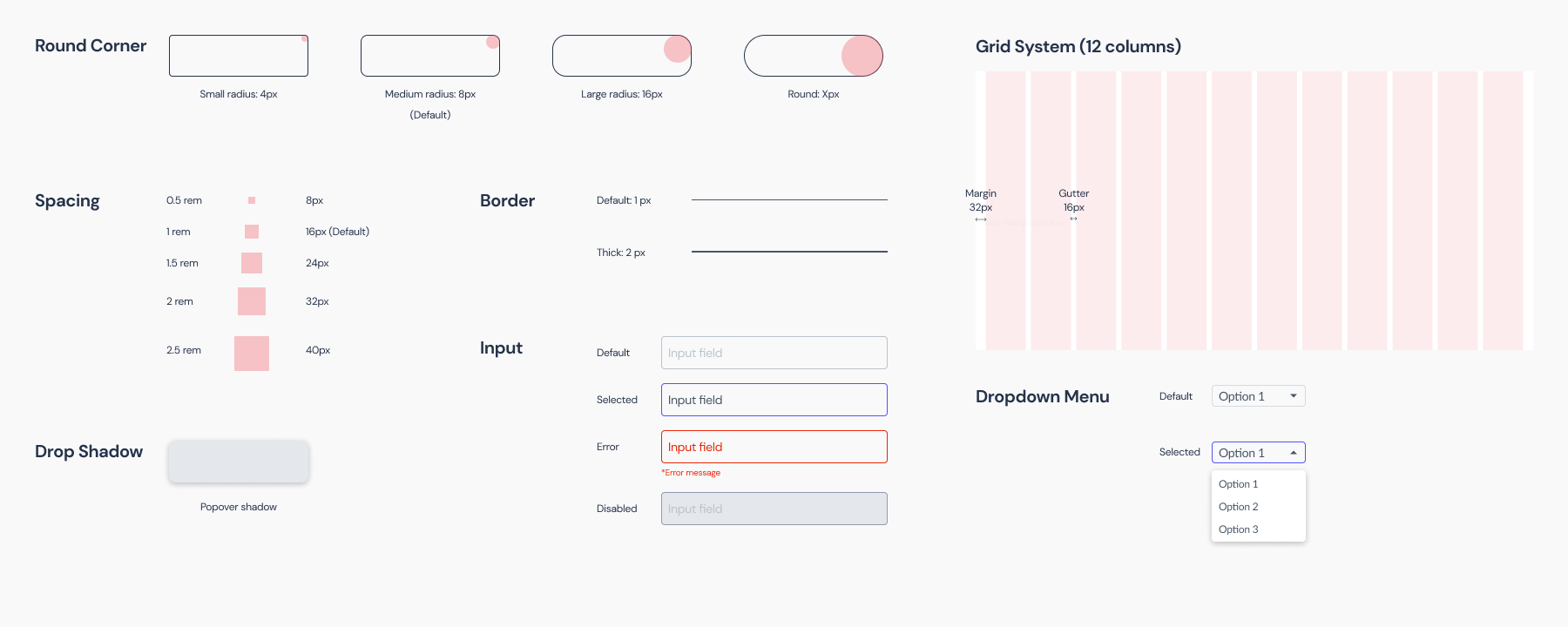
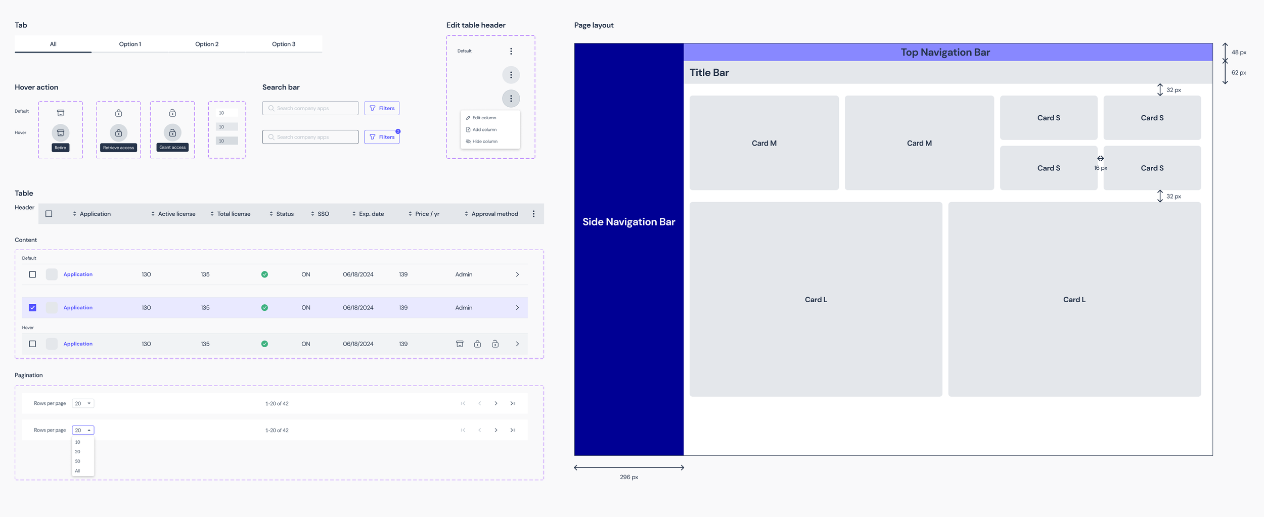
Introducing the new design system
Color Palette & Typography
Iconography
Buttons & Cards
Layout
Components
TAKEAWAYS
Communication is the key
This is the first time the three of us collaborated on a project, and the first time we work with this client. Even though we talked about our strengths and weaknesses on our first meeting, it still took us some time to figure out each other’s way of working. Though we were designing the pages separately, the work was done in a very collaborate manner by creating the design system at first.
Come Prepared
When working in such a new field, it is important to put in the time and effort upfront to better understand what we’re designing for. While the client provided the framework to illustrate their goal, I spent time researching the market and competitors to understand the business.
Big Picture Thinking
The tasks given to us were specific, more UI oriented. However, the more we talked with the client, the more problems were revealed. We decided to take the top-down approach, to take a deeper dive into the overall project structure, and to prioritize our tasks from there.
Next steps…
01
User Test
Due to the time constraint, we weren’t able to do the user testing. The next step would definitely be user testing before proceeding further.
02
Additional Features
One important feature we need to accommodate from the user interview is “switch role”. We need to figure out how this will work within all pages.
03
User Side of the Story
We only focused on the admin side this time. However, understanding the user side of the story will also help shape and craft the contents and design.
